Exploring categorical data
based on IMS Ch 4: Exploratory data analysis
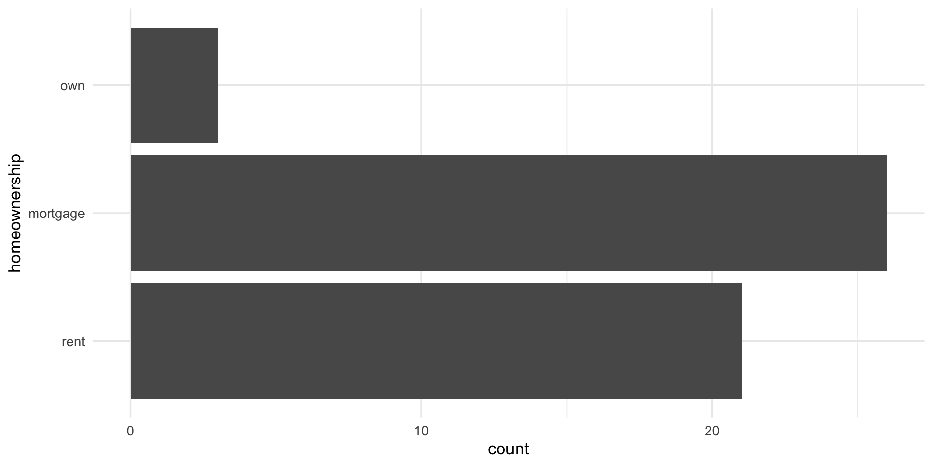
Bar chart 1 categorical variable
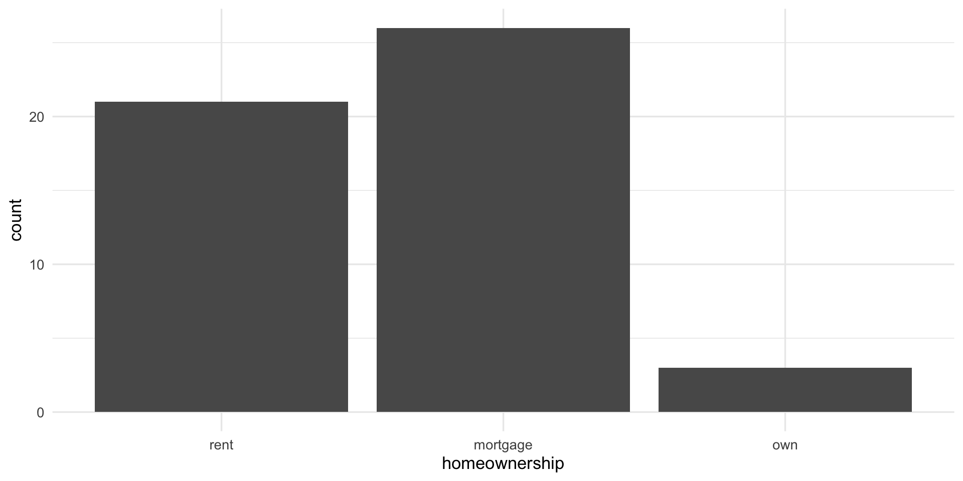
Bar chart 1 var, y-axis
- plot frequency table
Bar plots with two variables
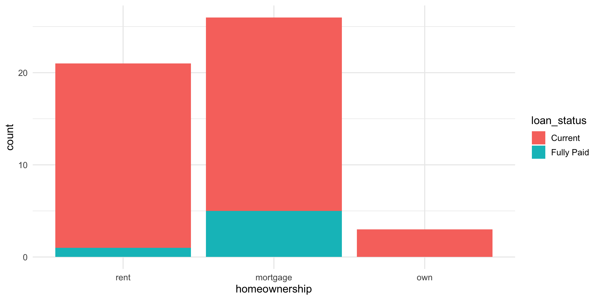
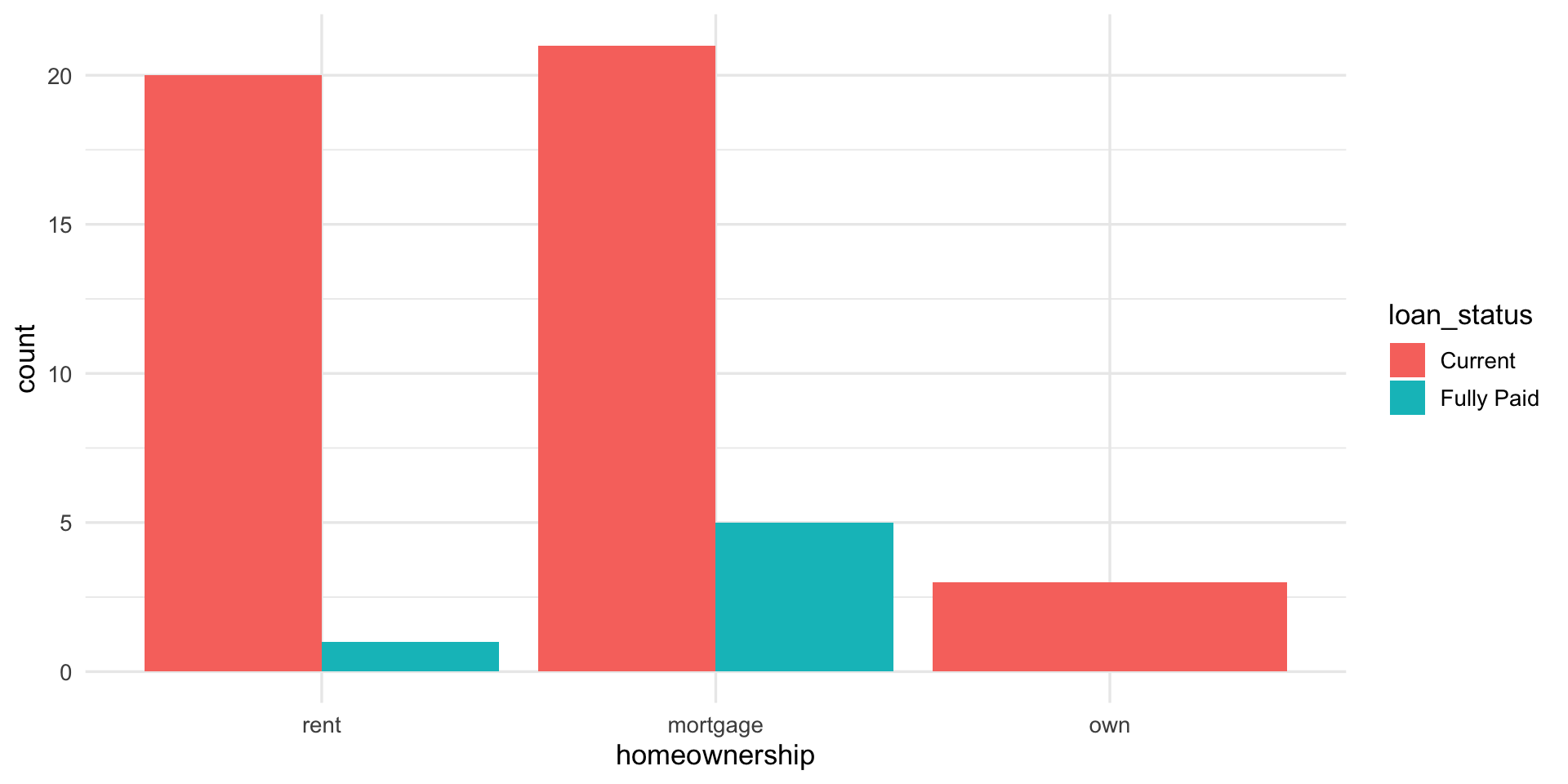
Bar plots with two variables
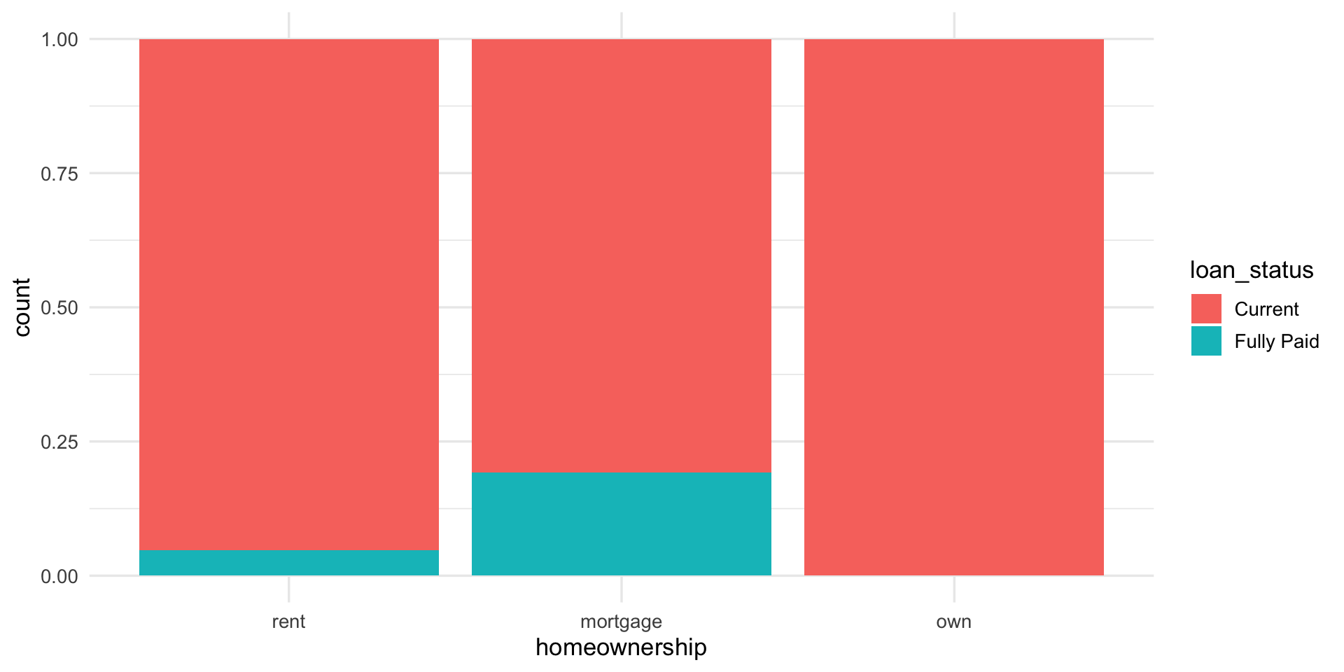
Standardized
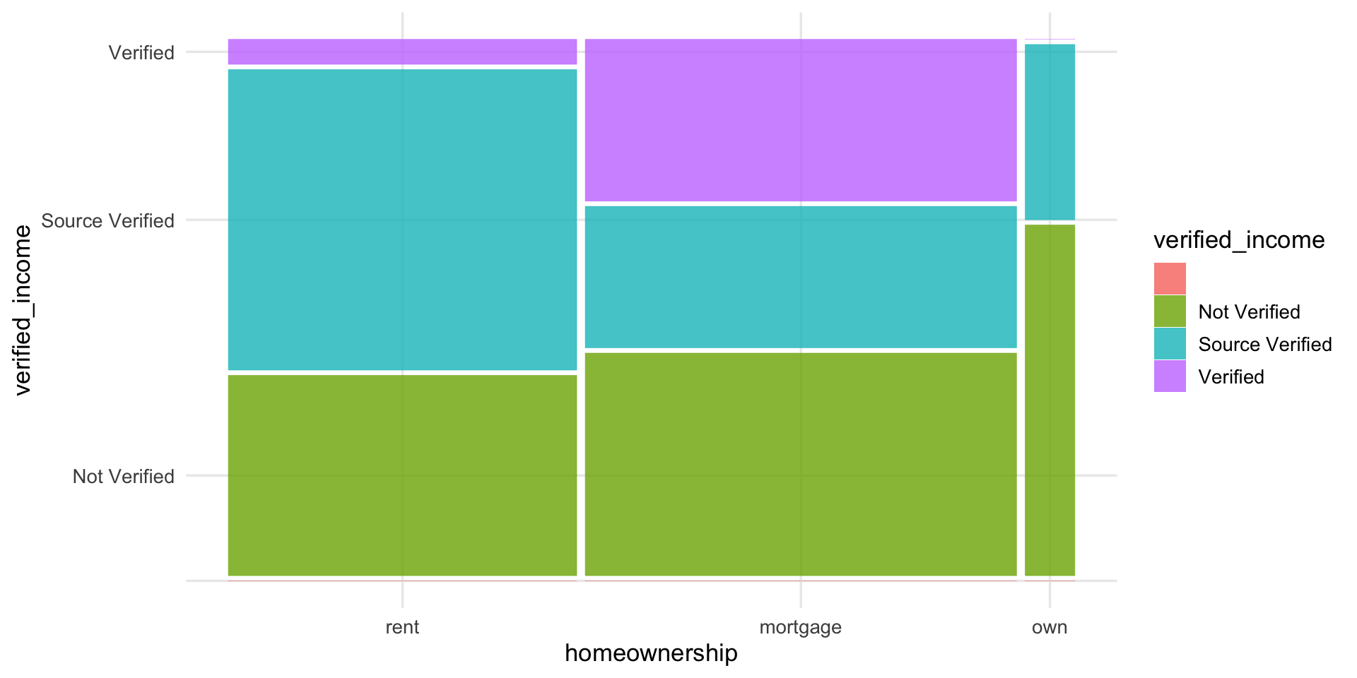
Mosaic plots
- similar to standardized stacked bar chart but still see relative group sizes of the primary variable (
homeownership)