Effective communication of exploratory results
based on IMS Ch 6: Applications: Explore
Outline
keep it simple
use color to draw attention
tell a story
order matters
pick the right chart
select meaningful colors
Steps in data analysis
Load the packages
Read the dataset
Glimpse the data
Rows: 464
Columns: 11
$ ticker      <chr> "ZTS", "ZTS", "ZTS", "ZTS", "ZTS", "ZTS", "ZTS", "ZTS", "Z…
$ name        <chr> "Zoetis Inc", "Zoetis Inc", "Zoetis Inc", "Zoetis Inc", "Z…
$ revenue     <dbl> 4233000000, 4336000000, 4561000000, 4785000000, 4765000000…
$ gp          <dbl> 2581000000, 2773000000, 2892000000, 3068000000, 3027000000…
$ rnd         <dbl> 427000000, 409000000, 399000000, 396000000, 364000000, 376…
$ netincome   <dbl> 245000000, 436000000, 504000000, 583000000, 339000000, 821…
$ assets      <dbl> 5711000000, 6262000000, 6558000000, 6588000000, 7913000000…
$ liabilities <dbl> 1975000000, 2221000000, 5596000000, 5251000000, 6822000000…
$ marketcap   <dbl> NA, NA, 16345223371, 21572007994, 23860348635, 26434855920…
$ year        <dbl> 2011, 2012, 2013, 2014, 2015, 2016, 2017, 2018, 2011, 2012…
$ industry    <chr> "Drug Manufacturers - Specialty & Generic", "Drug Manufact…
Keep it simple
what do you want your audience to see?
Use colors to group items or differentiate between items
Example
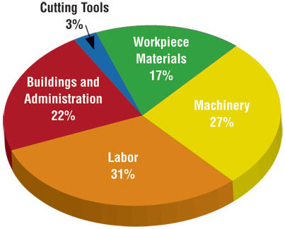
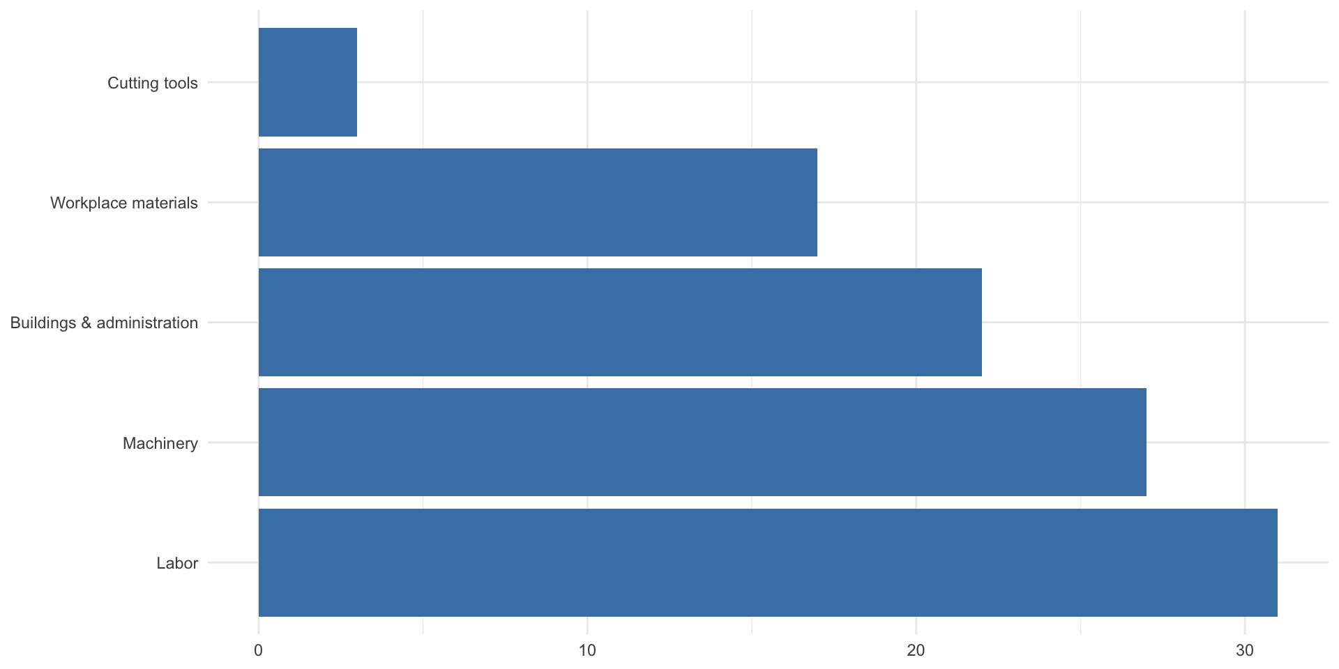
A pie chart (with added irrelevant features) as compared to a simple bar plot


bar_chart from ggcharts
website: bar_chart

Your turn
create a bar chart of the top 5 health companies by 2017 marketcap
use the
health_cosdatasetformat the y-axis to show billions of dollars
eliminate the x-axis label, the y-axis label
title the chart “Top 5 Drug Companies by 2017 Marketcap”
lollipop_chart from ggcharts

Your turn
create a lollipop_chart of the top 5 health companies by 2017 research and development expenditure (
rnd)use the
health_cosdatasetformat the y-axis to show billions of dollars
eliminate the x-axis label, the y-axis label
title the chart “Top 5 Drug Companies by 2017 Research and Development Expenditure””
Use color to draw attention

highlight_spec from ggcharts

Your turn
create a lollipop_chart of the top 5 health companies by 2017 research and development expenditure (
rnd)use the
health_cosdatasetformat the y-axis to show billions of dollars
eliminate the x-axis label, the y-axis label
title the chart “Top 5 Drug Companies by 2017 Research and Development Expenditure””
highlight the company with the highest research and development expenditure
Facets (subplots)
- Use
bar_chartfrom theggchartspackage create a separate a bar chart of the `revenue`` for “Abbott Laboratories”, “Agilent Technologies Inc” and “Amgen Inc” for the years 2015-2018. - Format the y-axis to show billions of dollars
- Eliminate the x-axis label, the y-axis label
- Title the chart: “Revenue for Abbott, Agilent and Amgen”
- Create a subplot for each year
Facet plot by year
health_cos |>
  filter(year %in% c(2015, 2016, 2017, 2018)) |>
  filter(name %in% c("Abbott Laboratories", "Agilent Technologies Inc", "Amgen Inc")) |>
  bar_chart(x = name, y = revenue, facet = year) +
  scale_y_continuous(labels = dollar_format(suffix = "B", scale = 1e-9)) +
  labs(x = NULL, y = NULL, title = "Revenue for Abbott, Agilent and Amgen")
Your turn - facets
- Use
bar_chartfrom theggchartspackage create a separate a bar chart of thenetincomefor “Cooper Companies Inc”, “Centene Corp” and “Cigna Corp” for the years 2013-2015. - Format the y-axis to show billions of dollars
- Eliminate the x-axis label, the y-axis label
- Title the chart: “Net Income for Cooper, Centene and Cigna”
- Create a subplot for each year
Quiz
- 5 multiple choice questions (one answer for each question) using
ggchartsandtidyversepackages and thehealth_cosdataset
