Effective communication of exploratory results
BUS 320
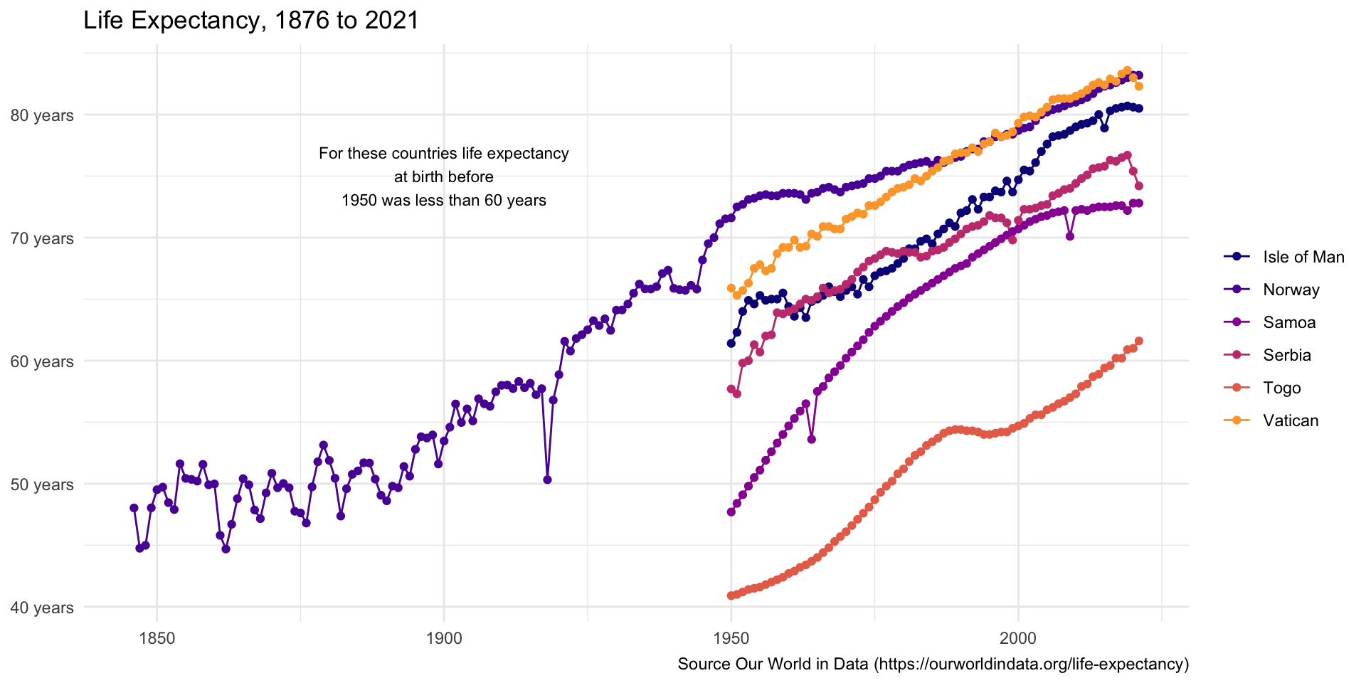
life_df |>
  ggplot(aes(x = Year, y = expectancy, color = Entity)) +
  geom_line() +
  geom_point()+
  scale_y_continuous(labels = number_format(suffix = " years")) +
  labs(x = NULL, y = NULL, color = NULL, title = "Life Expectancy, 1876 to 2021", caption = "Source Our World in Data (https://ourworldindata.org/life-expectancy)") +
  scale_color_viridis_d(option = "plasma", begin = 0, end = 0.8)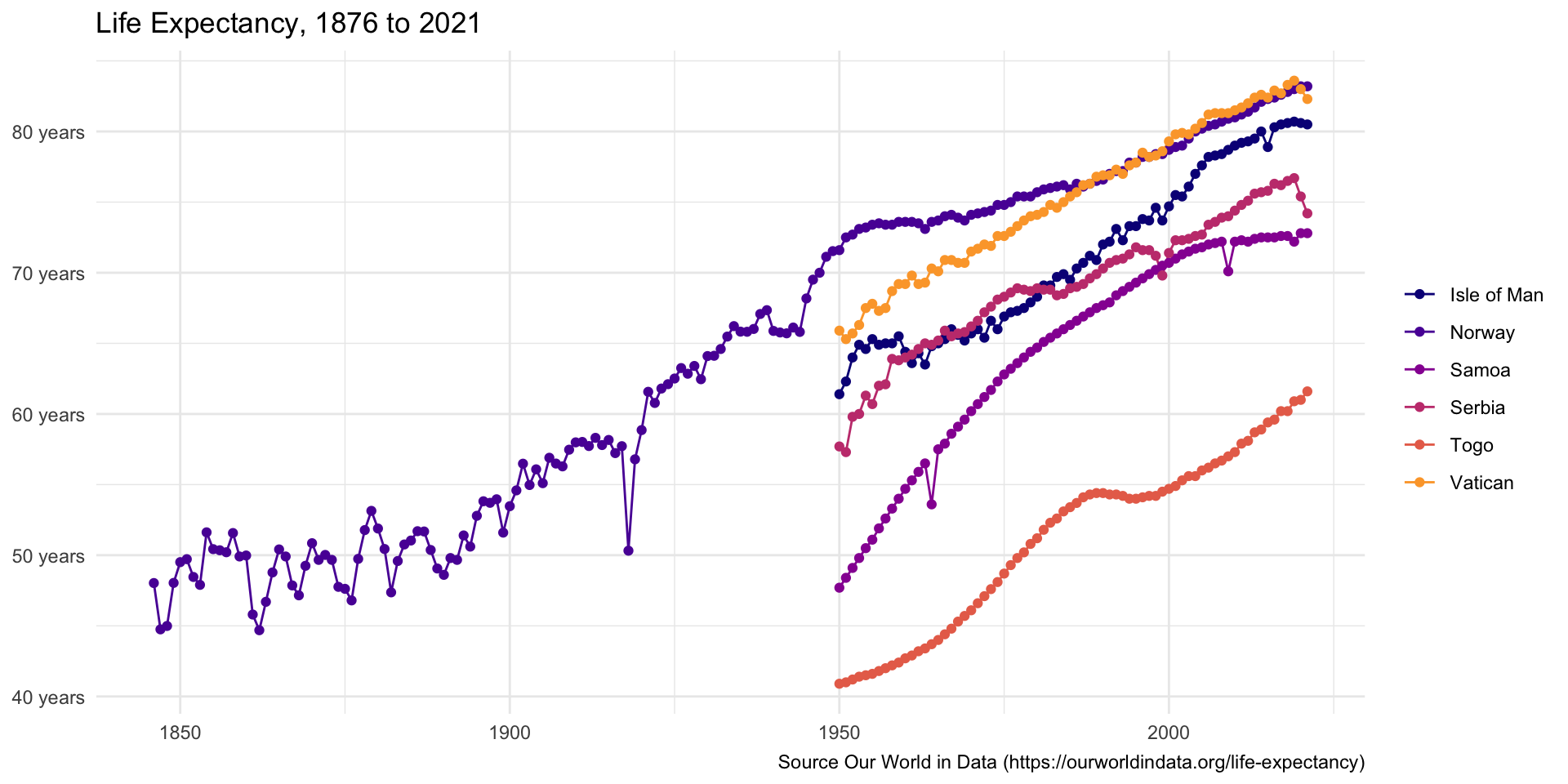
Add text the plot
- add a text annotation to the plot