# Load required packages
library(tidyverse)  # For data manipulation
library(DT)         # For interactive tables
library(scales)
theme_set(theme_minimal())


# Create sample revenue data
revenue_data <- tribble(
  ~Month, ~Revenue, ~Target, ~Region,
  "Jan", 45000, 50000, "North",
  "Feb", 52000, 50000, "North",
  "Mar", 48000, 50000, "North",
  "Jan", 38000, 40000, "South",
  "Feb", 41000, 40000, "South",
  "Mar", 39000, 40000, "South"
)Introduction to Quarto Dashboards
BUS 320
What We’ll Cover Today
- What are Quarto Dashboards and why use them?
- The basic structure of a dashboard
- Creating pages, rows, and columns
- Adding interactive tables and charts
- Sizing and layout control
- Putting it all together with business examples
What Are Quarto Dashboards?
Purpose: Make it simple to create compelling interactive dashboards in R, Python, Julia, and Observable
Why Dashboards Matter in Business:
- Present financial information visually
- Allow stakeholders to interact with data
- Combine multiple metrics in one view
- Update automatically when data changes
- Share insights across the organization
Dashboard vs. Report
Traditional Report
- Static document
- Fixed layout
- Manual updates
- One-way communication
- Usually PDF or printed
Interactive Dashboard
- Dynamic and interactive
- Flexible components
- Auto-updates
- Two-way engagement
- Web-based viewing
Your First Dashboard: The Basics
The minimum you need to create a dashboard:
Key Point
You must specify format: dashboard in your YAML header to create a dashboard - this is different from regular Quarto documents which use html or pdf formats.
Dashboard Structure: The Building Blocks
Three Levels of Organization:
-
Level 1 headers (#) = New Page
- Used when you have multiple pages in your dashboard
- Like tabs at the top of a website
-
Level 2 headers (##) = New Row (in default layout)
- Divides your page into horizontal sections
- Each row can contain multiple cards
-
Level 3 headers (###) = New Card
- Individual containers for your charts, tables, or text
- The actual “boxes” you see in a dashboard
Example: Basic Dashboard Structure
Revenue Dashboard
Interactive Table with DT
About the DT Package
DT is one of several packages that can create interactive tables in Quarto Dashboards. Users can sort columns, search for values, and page through large datasets.
Creating Visualizations
Code
# Create a bar chart comparing revenue to target
ggplot(revenue_data, aes(x = Month, y = Revenue, fill = Region)) +
  geom_col(position = "dodge") +  # Dodged bars for side-by-side comparison
  geom_hline(yintercept = 45000, linetype = "dashed", color = "red", linewidth = 3) +  # Target line
  labs(
    title = "Revenue by Month and Region",  x = "Month",  y = NULL,  fill = NULL
  ) +
scale_y_continuous(labels = label_dollar()) 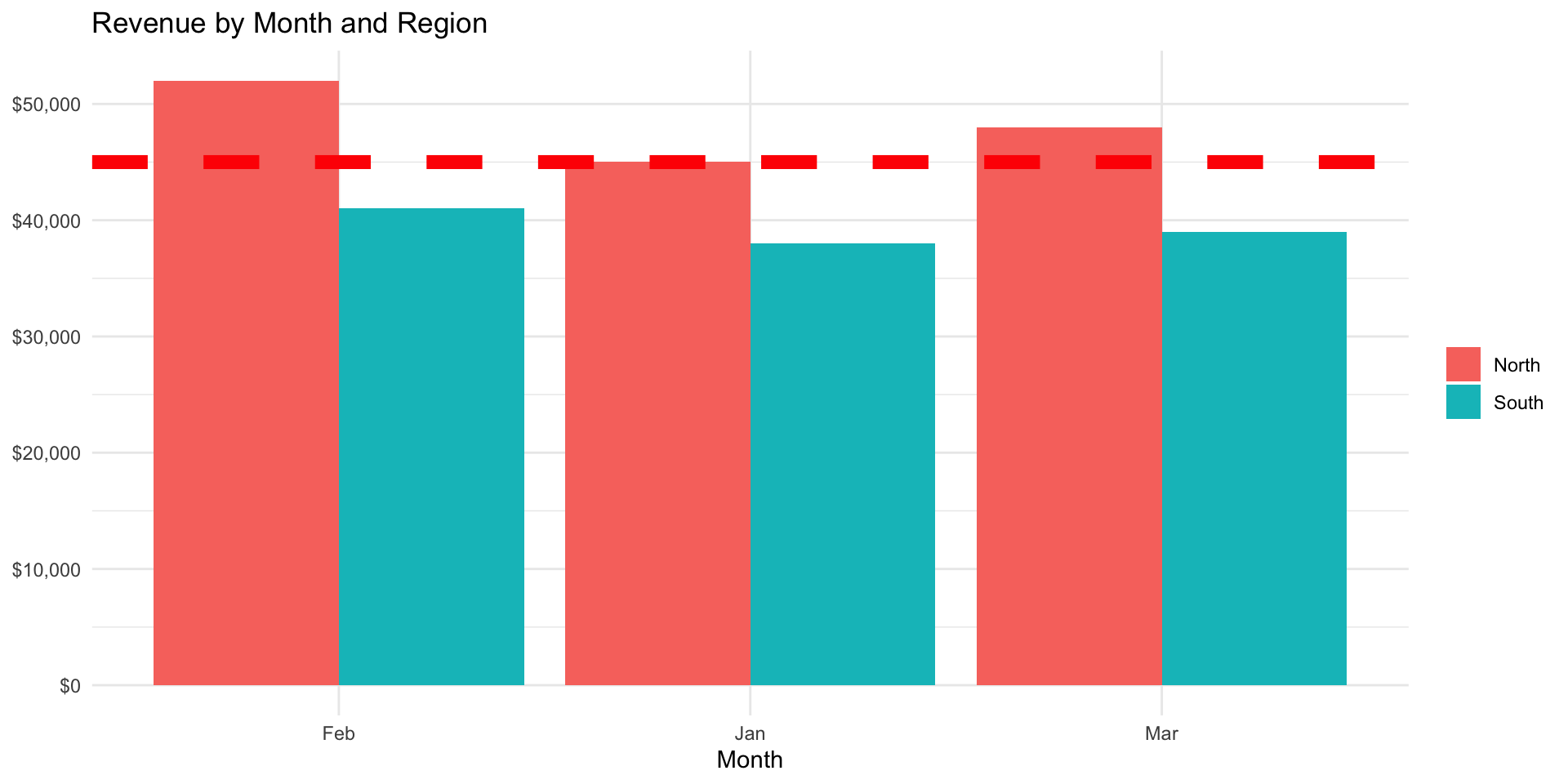
Layout Control: Sizing Components
You can control the size of rows, columns, and cards using attributes:
Sizing Syntax
Use {width=} for horizontal sizing and {height=} for vertical sizing. Values can be percentages (60%) or pixels (400px).
Orientation: Rows vs. Columns
Default layout is by rows, but you can change to columns:
Complete Dashboard Example
Dashboard Structure
This example includes:
- Two pages (Overview and Details)
- Multiple rows with different heights
- Interactive table and visualizations
- Custom sizing for components
Ex: Financial Dashboard
YAML Header:
Page 1 - Overview:
Page 2 - Details:
Cards: The Content Containers
What are Cards?
- Containers for plots, tables, and text
- Created with Level 3 headers (###)
- Automatically styled with borders and backgrounds
- Can be sized independently
Content that goes in Cards:
- ggplot visualizations
- Interactive tables (DT)
- Value boxes showing single metrics
- Static images or logos
- Markdown text and explanations
Automatic Sizing and Equal Division
When you don’t specify sizes:
- Quarto divides space equally among components
- All cards in a row get equal width
- All rows on a page get equal height
- This creates a balanced, grid-like layout
- Works well for similar types of content
Example:
All three charts will be 33.3% width each.
Balance Sheet Dashboard
Adding Context with Value Boxes
# Calculate key metrics
total_assets <- balance_sheet %>%
  filter(Amount > 0) %>%
  summarize(total_assets = sum(Amount, na.rm = TRUE)) %>%
  pull(total_assets)

total_liabilities <- balance_sheet %>%
  filter(Amount < 0, str_detect(Category, "Liabil")) %>%
  summarize(total_liabilities = sum(abs(Amount), na.rm = TRUE)) %>%
  pull(total_liabilities)

current_ratio <- total_assets / total_liabilities
In your dashboard, you could show these as value boxes:
Value Boxes
Use value boxes to highlight single, important metrics. They draw attention and provide quick insights.
Common Dashboard Patterns
Pattern 1: Executive Summary + Details
- Page 1: High-level KPIs and trends
- Page 2: Detailed data tables
Pattern 2: Comparison Dashboard
- Multiple rows showing different perspectives
- All comparing the same metrics (actual vs budget, region vs region)
Pattern 3: Drill-Down Dashboard
- Page 1: Company-wide totals
- Page 2: Department breakdown
- Page 3: Individual transactions
Tips for Effective Dashboards
Design Principles:
- Prioritize information - Most important metrics should be largest and highest
- Use consistent colors - Same metric should always be the same color
- Limit choices - Too many options overwhelm users
- Tell a story - Guide users through the data logically
- Test on actual data - Sample data may hide real-world issues
- Consider your audience - CFO needs different view than AR clerk
Common Mistakes to Avoid
Watch out for:
- Forgetting
format: dashboardin YAML → creates HTML doc instead - Using wrong header levels → structure doesn’t work as expected
- Overcomplicating with too many pages/rows → users get lost
- Not testing interactivity → some features only work when rendered
- Ignoring mobile view → dashboard looks great on desktop, terrible on phone
- Making everything the same size → nothing stands out as important
Resources and Next Steps
Where to Learn More:
- Quarto Dashboard Documentation: https://quarto.org/docs/dashboards/
- Example dashboards in the documentation
- UCSB Faculty Seminar Series: Grow Your Data & Team Science Skills https://learning.nceas.ucsb.edu/2024-03-ucsb-faculty/session_10.html
Summary: Key Takeaways
What We Learned:
- Dashboards make data interactive and accessible
- Structure: Pages → Rows → Cards (# → ## → ###)
- Specify
format: dashboardin YAML - Use
{width=}and{height=}for sizing - DT package creates interactive tables
- Default orientation is by rows, can change to columns
- Cards are containers for all dashboard content
- Design for your audience and purpose